Every house has untapped potential. Far too many of them, whether clad in brick, stone, stucco, wood or composite siding, sit atop the land in unremarkable ways, barely making any meaningful connection to it. Good landscape designers make it a top priority to establish that connection, to make the house seem at home in its environment. However, choosing a paint palette, or designing a landscape around an existing palette, is a daunting task to many homeowners.
Painted or stained houses offer exciting potential because such an array of hues and tones are available. In some situations existing paint colors cannot be easily changed, perhaps due to homeowner’s association regulations or because certain siding arrives prefinished. In other situations it is best not to disturb an existing garden but instead repaint the house. In either case the principles are the same. Let’s look at the process, rationale and artistry that designers employ to create that seamless connection.
Paul Anater
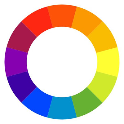
Understand Color BasicsThe first step in employing color (hue) is to understand the basics. The color wheel in its simplest form is shown here. Complementary colors lie across from each other on the wheel and create palettes full of interest when used together. Adjoining colors can also work together and can be a safer choice for the less adventurous. A tint is created when white is added to a hue; a shade is created when black is added; a tone is created when gray is added.
Another way of explaining color basics is to remember the colors of the rainbow from grade-school science and the corresponding mnemonic ROY G. BIV. Looking at it this way, red complements green, orange complements blue, and yellow complements violet.
Stillwater Architecture L.L.C.
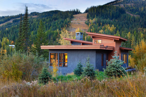
The home shown here makes a profound connection with its environment. Sensitive design has enabled its roofline to soar with the surrounding Colorado mountains.
Let’s focus, however, on its color palette. We see that two complementary colors, blue and orange, were used, creating a pleasing scheme that speaks to the landscape. Its stucco, gray with undertones of blue, is pulled into the landscape by the thoughtful placement of several blue spruce trees. The house trim, stained an orange-brown, makes a meaningful connection with the native grasses in the immediate landscape and beyond.
This house is truly at home. If it were instead painted white or cream with black shutters, as is the norm in many parts of suburbia, it would appear oddly out of place.
Liquidscapes
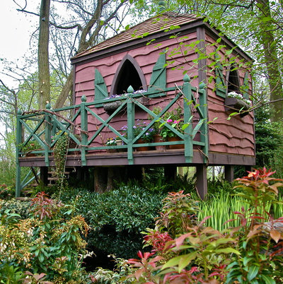
This building looks as if it could have leaped out of a children’s book. Two complementary colors, red and green, have been used. The red has been tinted (white has been added), and the red and the green have been toned down with the addition of gray. The purple trim has also been toned down with gray to make it blend more subtly with the red.
Now on to the fun part. Notice how the multicolored foliage of the lily of the valley bush (
Pieris japonica cvs, zones 4 to 8; find your zone) repeats the paint colors, creating a homogenous space. Additionally, notice how the verticality of the Japanese water iris (
Iris ensata ‘Variegata’, zones 5 to 9) pulls the eye upward toward the dwelling.
Arterra Landscape Architects
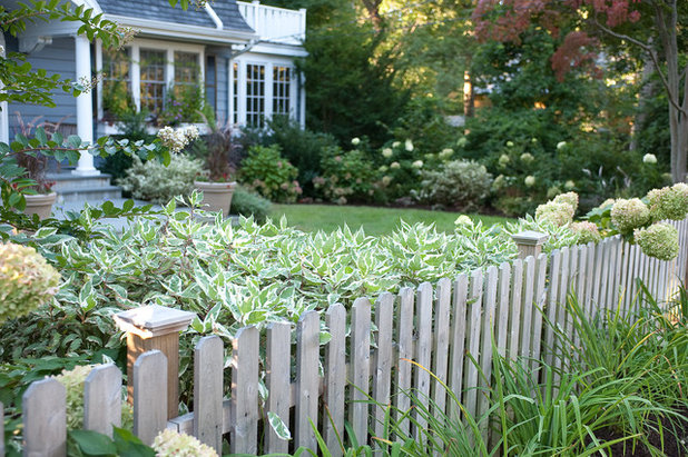
This home and landscape employ adjacent colors on the wheel, rather than complementary colors, as we have seen in the previous photographs. The effect is serene and homogenous. The ornamental grass planted en masse pulls the color and texture off the home and into the garden.
Which of these examples feels most comfortable to you? Answering this question honestly is the first step to creating your home-garden connection.
Jay Sifford Garden Design
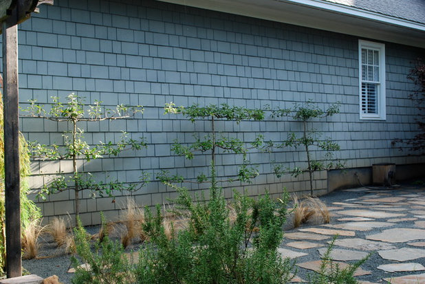
Consider the Primary Direction in Which Your Siding RunsTo create that homogenous connection between home and landscape, you may want to study your siding with regard to shape, run and texture. If your siding runs primarily horizontally, you can reinforce your design by choosing trees, shrubs or perennials that grow in a corresponding manner. Notice how these espaliered apple trees pick up the primary horizontal run of this siding. If your siding runs vertically, consider planting contained bamboo or a very upright-growing ornamental grass, such as ‘Northwind’ switchgrass (
Panicum virgatum ‘Northwind’, zones 2 to 9).
Le jardinet
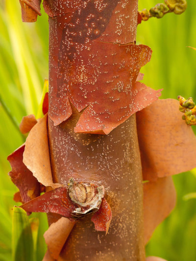
Reinforce Your Home’s TextureIf your home is clad in stucco or rough-sawn timber, consider incorporating some very textural plants into your design to create continuity through texture. Plants such as paperbark maple (
Acer griseum,
zones 4 to 8, shown here), river birch (
Betula nigra,
zones 3 to 8) and various ornamental grasses are useful in making this connection. In fact, the swirling growth pattern of some grasses mimics the circular technique frequently used in applying stucco.
Art in Green
Create the Foundation With GreenGreen is the great mediator on the color wheel, falling between the warm colors of red, orange and yellow and the cool colors of blue, indigo and violet. Herein lies its power as both the foundation for your plant palette and as a soothing place for the eye to rest between jolts of color.
This is not to say that green can’t earn its place in the spotlight, because green isn’t always mundane. If your plant palette runs more toward blue, consider using a green shrub with blue undertones, such as Blue Cascade distylium (
Distylium ‘Blue Cascade’, zones 6 to 9). As a designer, I enjoy directing the eye and marking entrances with chartreuse by planting Golden Pacific shore juniper (
Juniperus conferta ‘Golden Pacific’, zones 6 to 9). A bit of research on the front end will keep your space interesting.
Bret Franks Construction, Inc.
Round Out Your Plant PaletteOnce you have designed the foundation of your plant palette, you can embellish and individualize it by adding colorful foliage to strengthen the connection between house and landscape.
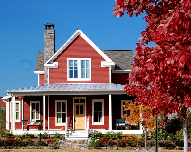
Red is a color that I refer to as a pivot hue, meaning that it can be placed between other colors to blend them harmoniously. For example, red in a darker tone can be useful in blending chartreuse and blue foliage. Additionally, red can be a stand-alone hue that can pull siding color into the landscape, as shown here.
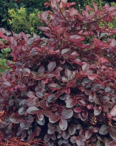
Southern Living Plant Collection
Red. Let’s look at some reds. Burgundies with undertones of blue and gray, such as this Chinese fringe flower (
Loropetalum cvs,
zones 7 to 9), are useful in pulling blue- and gray-toned siding into the landscape. Plants that perform similarly include Ruby Falls redbud (
Cercis canadensis ‘Ruby Falls’, zones 6 to 8), Grace smoke tree (
Cotinus ‘Grace’, zones 5 to 9), Crimson Queen Japanese maple (
Acer palmatum var.
dissectum ‘Crimson Queen’, zones 5 to 8) and certain cultivars of coral bells (
Heuchera cvs, zones 4 to 9).
See more plants with red foliage
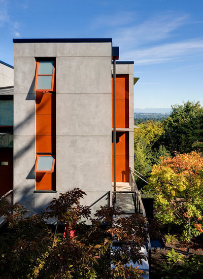
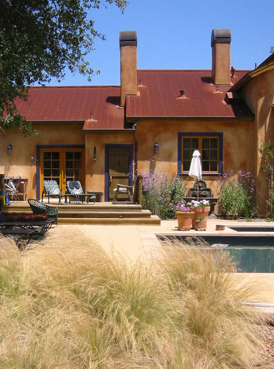
Prentiss Balance Wickline Architects
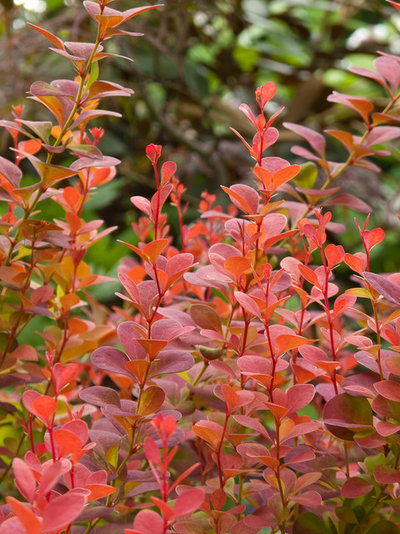
Orange. Orange, adjacent to red on the color wheel, can generally be used interchangeably with red but usually not in conjunction with it. It is, therefore, a pivot color when used in conjunction with greens and blues, but can also be a stand-alone color, as shown here.
Le jardinet
Although some plants exhibit orange foliage seasonally, true orange foliage is rarer than red. Noteworthy plants with orange foliage include Orange Rocket barberry (
Berbers thunbergii ‘Orange Rocket’, zones 4 to 9, shown here), New Zealand sedge (
Carex testacea, zones 6 to 10), Marmalade coral bells (
Heuchera ‘Marmalade’, zones 4 to 9) and Orangeola Japanese maple (
Acer palmatum var
. dissectum ‘Orangeola’, zones 5 to 8).
Seasonal orange flowers can be found among roses, hyssops, dahlias and coneflowers.
See more orange flowers
BEHR®
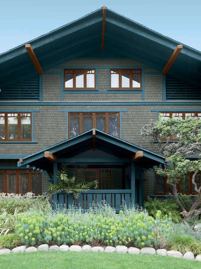
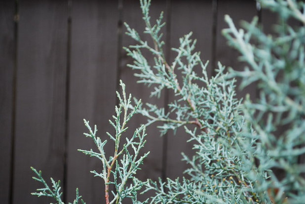
Blue. Blue is the third pivot color. Its placement on the color wheel is alongside green, which allows its use as a neutral (think of blue jeans). It is also a cool color, useful as a calming presence among brighter warm and cool hues such as red, orange and pink. Additionally, it is a stand-alone color, as shown here. The bluish foliage of the spurge (
Euphorbia cvs, zones 6 to 11) and Russian sage (
Perovskia atriplicifolia cvs, zones 4 to 9) pulls the toned-down blue trim into the landscape with beautiful results.
Jay Sifford Garden Design
Fortunately, a wide variety of blue foliage plants is available. Plants to consider include Blue Ice Arizona cypress (
Cupressus arizonica ‘Blue Ice’, zones 6 to 9, shown here), blue atlas cedar (
Cedrus atlantica ‘Glauca’, zones 6 to 9), Blue Spruce stonecrop (
Sedum reflexum ‘Blue Spruce’, zones 3 to 11), Woodlander’s Blue zenobia (
Zenobia pulverulenta ‘Woodlander’s Blue’, zones 5 to 9), Blue Dune lyme grass (
Leymus arenarius ‘Blue Dune’, zones 4 to 9), Dallas Blues switchgrass (
Panicum virgatum ‘Dallas Blues’, zones 4 to 9) and Firewitch cheddar pinks (
Dianthus gratianopolitanus ‘Firewitch’, zones 3 to 9).
See more blue and gray plants
Westover Landscape Design, Inc.
Variegated. Variegated foliage can multitask, pulling two or more hues into the landscape for a finely tailored, professional look.
Jay Sifford Garden Design
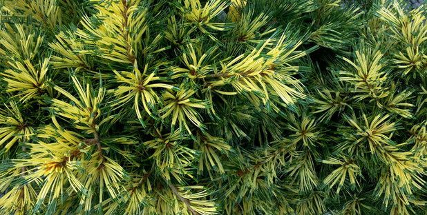
White and green come to mind when most people think of variegated foliage. There is, however, a wide variety of variegation available, as is seen here with Japanese white pine (
Pinus parviflora ‘Ogden Janome’, zones 4 to 9). This cultivar sports needles that start out green at the base, then change to yellow and then to blue. A plant such as this is invaluable in pulling hues from house to landscape.
White and green variegated plants to consider include Patriot hosta (
Hosta ‘Patriot’, zones 3 to 9), Floating clouds redbud (
Cercis canadensis ‘Floating Clouds’, zones 5 to 9), Radiance abelia (
Abelia x
grandiflora ‘Radiance’, zones 6 to 9) and variegated Japanese water iris (
Iris ensata ‘Variegata’, zones 5 to 9).
Variegated plants other than white and green include various Japanese maples, such as Shirazz (
Acer palmatum ‘Gwen’s Rose Delight’, zones 5 to 8), gold dust plant (
Aucuba japonica cvs, zones 6 to 10), various hosta cultivars, Rose Glow barberry (
Berberis thunbergii ‘Rose Glow’, zones 4 to 8) and Kaleidoscope abelia (
Abelia x
grandiflora ‘Kaleidoscope’, zones 6 to 9).
Exteriorscapes llc
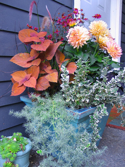
Finish With Seasonal Container PlantingsOne of the easiest ways to create that home-garden connection is to purchase complementary ceramic pottery and plant seasonally with annuals. Notice how this blue ceramic piece blends tastefully with the gray house siding. The blue is both reinforced with blue foliage and contrasted by a complementary orange Sedona coleus (
Solenostemon scutellarioides ‘Sedona’, zone 11).