Winter’s cold, dreary days are the most splendid days for daydreaming. Many people find distraction and solace in planning outdoor projects that will commence with the warmer, kinder days of spring. Planning now will save precious time later, particularly if painting, staining or planting is involved.
Between bouts of studying plant catalogs and reading reviews of the latest lawn-care equipment, take time to consider a larger issue: How well does your home actually fit into your landscape? If the question makes you cringe because your home looks like it landed upon, rather than sprang up from, your landscape, it may be time to plan that springtime course of action. Let’s tackle this together.
Bliss Garden Design
Regardless of your home’s architectural style or your personal affinities, this is our desired result: a home that appears effortlessly nestled into its space. Even though this garden is complex, the entire vignette reads as seamless, peaceful and refreshing. Read on to see why, and how your house can blend with the landscape.
Paul Anater
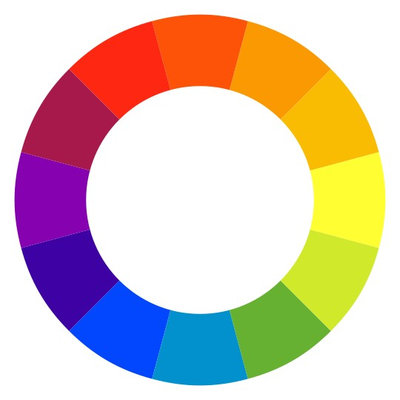
Start With Color BasicsA quick lesson in color is a necessary starting point to create your home-garden connection. Shown here is the color wheel in its most basic form. Analogous colors, such as orange and yellow, are positioned next to each other on the wheel. Using analogous colors together, as in the previous example, creates a sublime sense of peace. Complementary colors, such as blue and orange, are positioned across from each other on the wheel. Using complementary colors together creates positive tension and interest. Remember, not all tension is bad.
Colors (hues) are lightened or tinted when white is added, shaded when black is added and toned down when gray is added.
Learn more about using the color wheel in your home
The Artist Garden
Connect Your Home’s Exterior to the Landscape
Brick. Brick is the traditional go-to choice for home cladding in many parts of the United States. From a design standpoint, one of the greatest things about brick is that it generally contains several hues with multiple shades and tones. The brick palette shown here includes pink, orange, burgundy, gray and black. Once you’ve determined the subtleties within your brick palette, creating a planting plan that includes foliage and flowers that pull from this palette is a simple thing.
Dark green is a safe foliage choice for many people. Even though this overused hue can be predictable and boring, dark green is useful in separating pops of color and providing the eye with a soothing place to rest. As a landscape designer, I use it thoughtfully.
How to Make Your Brick House Feel at Home in the Landscape
Jay Sifford Garden Design
Stone. Stone used for house cladding is generally a neutral color — grays and browns. But even a seemingly neutral stone has variations and undertones of other hues. These undertones can be capitalized on in a way that is anything but boring and predictable. Gray stone may have undertones of blue, brown or black, while tan stone most likely has tones of orange or even pink. These tones can be enhanced by introducing thoughtfully chosen foliage, flowers and trim color.
In the example shown here, the gray stone works well with blues and pinks; the foliage, flowers and complementary brick set this home apart from its neighbors.
How to Make Your Stone House Feel at Home in the Landscape
BEHR®
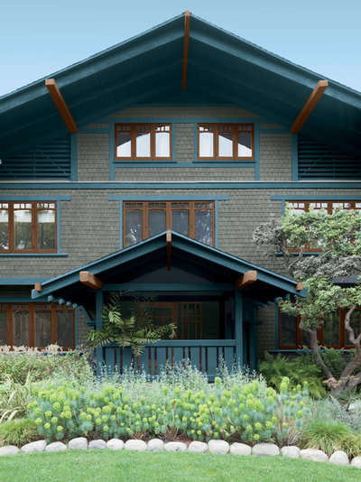
Painted or stained siding. Choices are virtually endless with painted or stained wood or stucco. Choose analogous hues from the color wheel for a quiet, understated look; use complementary colors for a brighter look; or pair a hue with a coordinating neutral, as shown here, for an updated classic look.
The gray shingles play down the blue trim in this example, but the blue holds its own to provide interest. Brown accents have an undertone of orange, which is complementary to blue (across from it on the color wheel). Finally, the house colors are grounded into the landscape by the prudent choice of blue and gray foliage.
How to Make Your Painted or Stained House Feel at Home in the Landscape
Gelotte Hommas Architecture
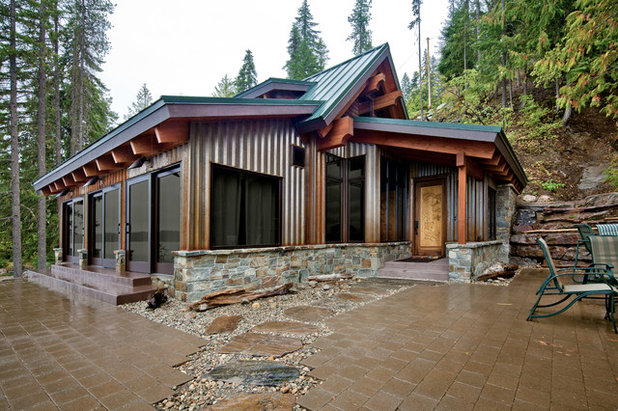
Metal. Metal siding can give a home a contemporary look as well as a rustic farmhouse look. Choices include aluminum, steel and copper. These can be allowed to rust or develop a patina that creates more straightforward choices with regard to coordinating elements.
In this example corrugated siding that is beginning to rust is the cladding of choice. The wooden trim has strong orange tones that complement the blue metal roof. Both hues are pulled downward by the stone foundation, then pulled outward by the stepping stones and manufactured pavers. By pulling hues downward and out, this home is well grounded in its environment. If plants were to be introduced, blue and orange foliage would further reinforce this connection.
How to Make Your Metal House Feel at Home in the Landscape
Gelotte Hommas Architecture
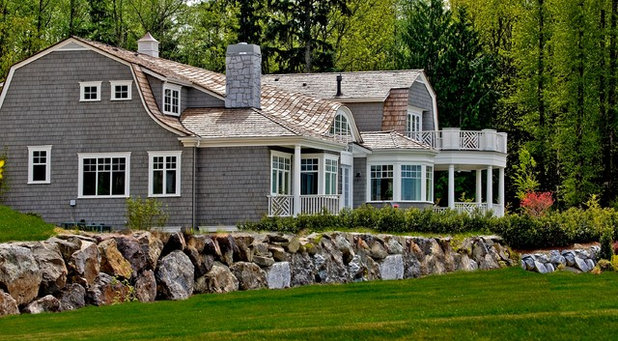
Roofing. Many homeowners neglect the opportunity to include roofing color and texture into their home-garden scheme. Like the avocado-colored kitchen appliances of the early 1970s, certain roofing choices can be challenging and can outlive their aesthetic usefulness.
This home has an understated elegance, which is due in large part to the fact that the roofing material makes a strong connection to the stone wall with regard to color and texture. Such a home is well integrated into its landscape.
How to Incorporate Your Roofing Into the Landscape
Jay Sifford Garden Design
Remember the Details
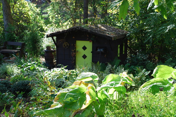
Front door. A well-chosen door color can make or break the connection you are working so hard to produce. The same color principles that work for siding and trim apply to door hues. You can play it safe by choosing analogous hues, or you can dare to choose complementary ones. Consider tints, tones and shades when choosing complementary door colors in order to eliminate a potential garish combination. For example, red is a popular door hue, but their undertones vary widely, from pinks to oranges to blues and grays; these can determine the success or failure of your composition.
In the example shown here, the color choices of brown and green are pulled from the surrounding forest. The bright chartreuse green door is a bold choice but an appropriate one for a shaded environment. The Sum and Substance hostas (
Hosta x
‘Sum and Substance’, USDA zones 4 to 9) mimic the green, pulling it into the garden to create a meaningful connection.
Browse front door color guides and palettes
WA Design Architects
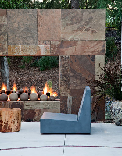
Hardscape. Backyard patios and decks have largely replaced the oversized front porches of the past. When planning a hardscape project, either DIY or professionally installed, carefully consider your choices with regard to color, texture and durability.
The multicolored stone in this example offers a rich palette from which to begin. Off-whites, grays, browns, oranges and pinks are all present, waiting to be pulled into the landscape while making a connection with the house. The blue chair complements the orange tones while making a peaceful connection with the pinks and grays. Thoughtful plant choices would include those with foliage and flowers in tones of pink, orange, blue and even dark aubergine and brown.
Margie Grace - Grace Design Associates
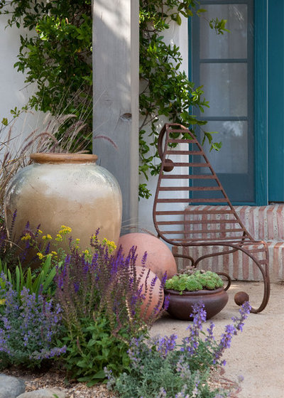
Accessories. Accessories are the proverbial icing on the cake, adding a sublime finished look to a vignette. Or so they should. Ceramic pottery, mailboxes, house numbers and sculptural pieces are all fair game in your quest for a meaningful home-garden connection. They can, in fact, bridge disparate elements.
In this thoughtful example, the blue door is pulled into the garden by the large ceramic pot and soft blue flowers, while the tinted orange brick steps are pulled forward by the lip of the pot, the rusted chair and the two decorative spheres. The horizontal lines in the chair speak to the vertical lines in the brick by creating positive tension, adding unique interest to this vignette.
Classic Nursery & Landscape Co. / Alan Burke, asla
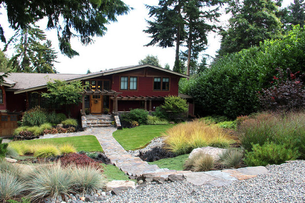
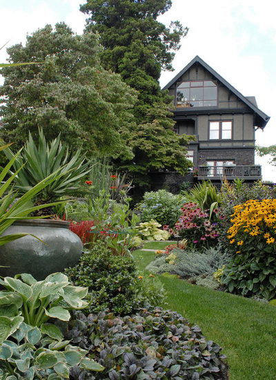
Put It All TogetherLet’s look at some elements of this garden and how they seamlessly marry this home to its lot. First, the tall house is intimately nestled against some even taller trees, not unlike the way a child nestles into the strong arms of a parent. Secondly, the heavily toned green, gray and red house colors are pulled into the garden by the ceramic pot and the bugleweed (
Ajuga reptans, zones 4 to 8). Additionally, the bugleweed picks up the texture of the home’s stone cladding. Pops of red flowers pull the window color into the garden, while pink coneflowers (
Echinacea purpurea,
zones 3 to 8) and black-eyed Susans (
Rudbeckia cvs, zones 5 to 9) add contrast to the almost monochromatic space. The subdued color palette and serpentine lawn pathway give the vignette an immediate sense of tranquility. And who doesn’t need more of that?