


Pastels dominate modern garden design, but Henri Matisse—leader of Fauvism ("wild beasts")—used bold, expressive color to convey emotion, not realism. His influence extends to Pantone fashion colors and can invigorate gardens through plants and accessories.
"Colors must react on one another." Complementary colors (opposites on the color wheel) create high contrast and drama: yellow/violet, orange/blue, green/red. Monotone evergreen backdrops heighten these contrasts.
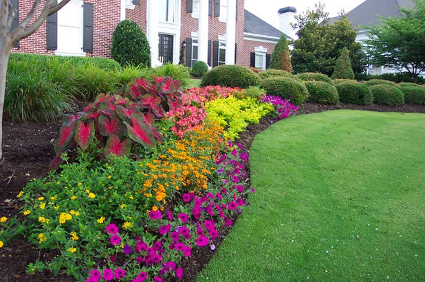

Bright sunlight intensifies reds, oranges, yellows, deep blues, purples—pastels wash out. Swaths and blocks of contrasted color energize plantings like Matisse's paintings.


Herbaceous perennials in red, orange, magenta, bright yellow guarantee energy. Bold colors steal the show—don't mix with pastels.

"Seek the strongest color effect." Cosmos, impatiens, verbena in informal masses show complementary colors working together.

Matisse's later paper cutouts (guaches découpés) inspire bold hardscape: colorful gravel circles in a cactus garden. Bright cushions, fencing, seating, walls, even birdhouses bring gardens to life, balanced by simple planting.


"Matisse: In Search of True Painting" at the Metropolitan Museum of Art, December 2012–March 2013.
Garden Planning Basics: From Vision to Reality
Create a Thriving Garden Space: Environmental Benefits and Practical Tips
Garden Planning and Maintenance Tips for Beautiful, Productive Outdoor Spaces
Elevate Your Garden with Arbors: Styles, Materials, and Design Ideas
Vegetable Gardening Basics: Start Small, Grow Organic, Eat Well
Amaryllis Revolution: New Hybrids Redefine a Classic Bulb
The Artist's Garden: Crafting a Landscape That Tells Your Story
Topsoil: The Secret to a Thriving, Resilient Garden
Garden Lighting Design: Power, Placement, and Fixture Selection for Nighttime Magic
Design Your Own Japanese Garden with Japanese Garden Design Software
What Makes a Garden? Defining the Space We Cultivate
Adding Color to Your Vegetable Garden: Beautiful & Beneficial Companion Plants
Designing With Conifers: The Art of Pairing Structure with Drama
Copyright © www.100flowers.win Botanic Garden All Rights Reserved