You've worked hard to create an interior space that expresses your sense of style. Your favorite finishes, textures and colors provide a sense of place that's uniquely you. Your outdoor living space should be an extension — or at least an echo — of your home's interior design, and color is an element that can easily be carried outdoors in hardscape materials, furnishings, decorative accents and, of course, plants. By using a dominant signature color, you can create a beautiful, cohesive look for your entire living environment.
Spinnaker Development
1. Begin your color story with your home's architecture. Your permanent landscape features — patios, planters, retaining walls, fences and other structures — should coordinate with your home's facade. Select your signature color to match or echo the paint, stain or natural finish of your home's exterior.
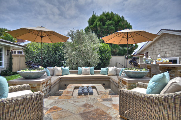
The outdoor space featured here uses beautiful stone that includes a gray-taupe color, similar to the house's shingles at its core, but expands and warms the palette in a natural and organic way. Similar neutral hues are used for the countertops and furniture. Pale blue as an accent color adds just the right amount of interest without disrupting the overall sense of calm.
A neutral plant palette of silvery blue is easy to replicate, especially in areas with lots of sunshine. Most plants with gray or blue foliage thrive in full sun, but the colors — reminiscent of water and ice — are visually cooling. Think succulents, grasses and herbs.
Gordon + Greineder
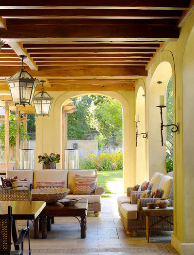
2. Expand from your home's interior color palette. Semienclosed outdoor spaces, like this one, that are immediately adjacent to the home should have a color connection that flows seamlessly from one space to the next. It needn't be the exact hue; a lighter tint or darker shade would work well, too.
The soft yellow light of this outdoor room makes it warm and inviting. The living space is visually expanded by showcasing a yellow flowery planting at the end of the framed vista.
Matthew Cunningham Landscape Design LLC
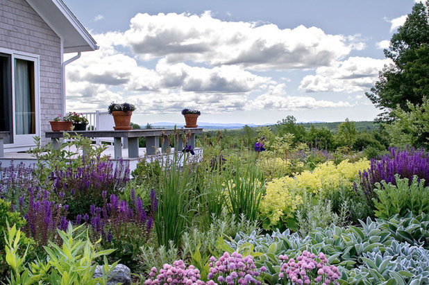
3. Use a strong color to unify a large garden space. Silvery lambs' ears echo the color of the home's facade and serve as a foundation for the garden in this example.
Vibrant purple is the dominant signature color that's used to carry the eye across a large, complex planting. Purple is a cool hue that harmonizes well with silver-gray.
Choose a flower or foliage color that can be interpreted through different plants based on bloom time and growing conditions, like microclimates or hydrozones.
Tommy Chambers Interiors, Inc.
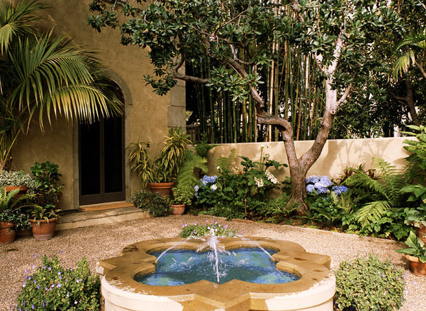
In a smaller space, like this courtyard, one special plant may be all you need. The rounded blue hydrangeas are a beautiful complement to the blue-tiled fountain. Used repeatedly as a signature plant, they also unify the diverse foliage plantings in the garden.
Jamie Herzlinger
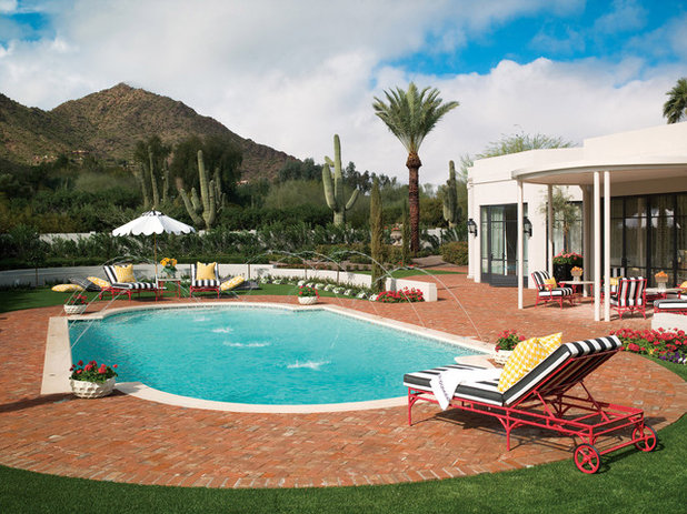
4. Choose a color for high drama. White and red contrast the beautiful natural surroundings of this home to the extreme.
The muted greens and browns of the desert landscape serve as a backdrop here, while the house and outdoor living space take center stage. White, as an echo of the home's color, is used like accent marks to draw the eye through the space and visually expand it. The limited palette of purple and white petunias and red Pelargoniums is used to great effect in echoing both the colors and the pattern of the pool furniture.
Remarkable Gardens
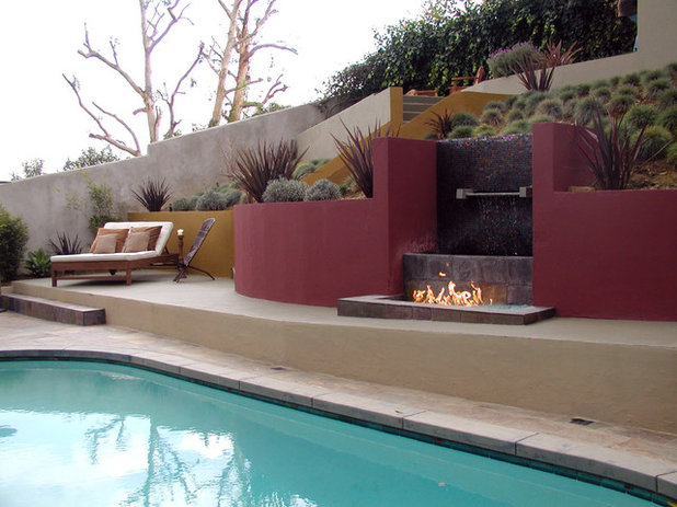
This water and fire feature stands out dramatically as a focal point — thanks, in great part, to its color. Red is the strongest color in the landscape because of its high contrast to green. (They are opposites on the color wheel.)
In addition, this structure is nicely anchored into its outdoor environment with a color echo via plant foliage. The bold red foliage of New Zealand flax (
Phormium spp) is a perfect match for the hardscape.
Hursthouse Landscape Architects and Contractors
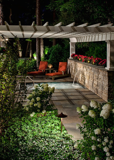
5. Choose a color for nighttime viewing. If you enjoy using your outdoor living space primarily in the evening, choose a hue that's visible in low light. White, silver, yellow and light pastels are the easiest colors for the human eye to see at dusk. Pale, smooth hardscape surfaces reflect light and are safer to use. Light flowers or variegated foliage in the garden will add depth to the landscape. Enjoy darker, richer hues as accents.